Oolio
Design Competition
Brief
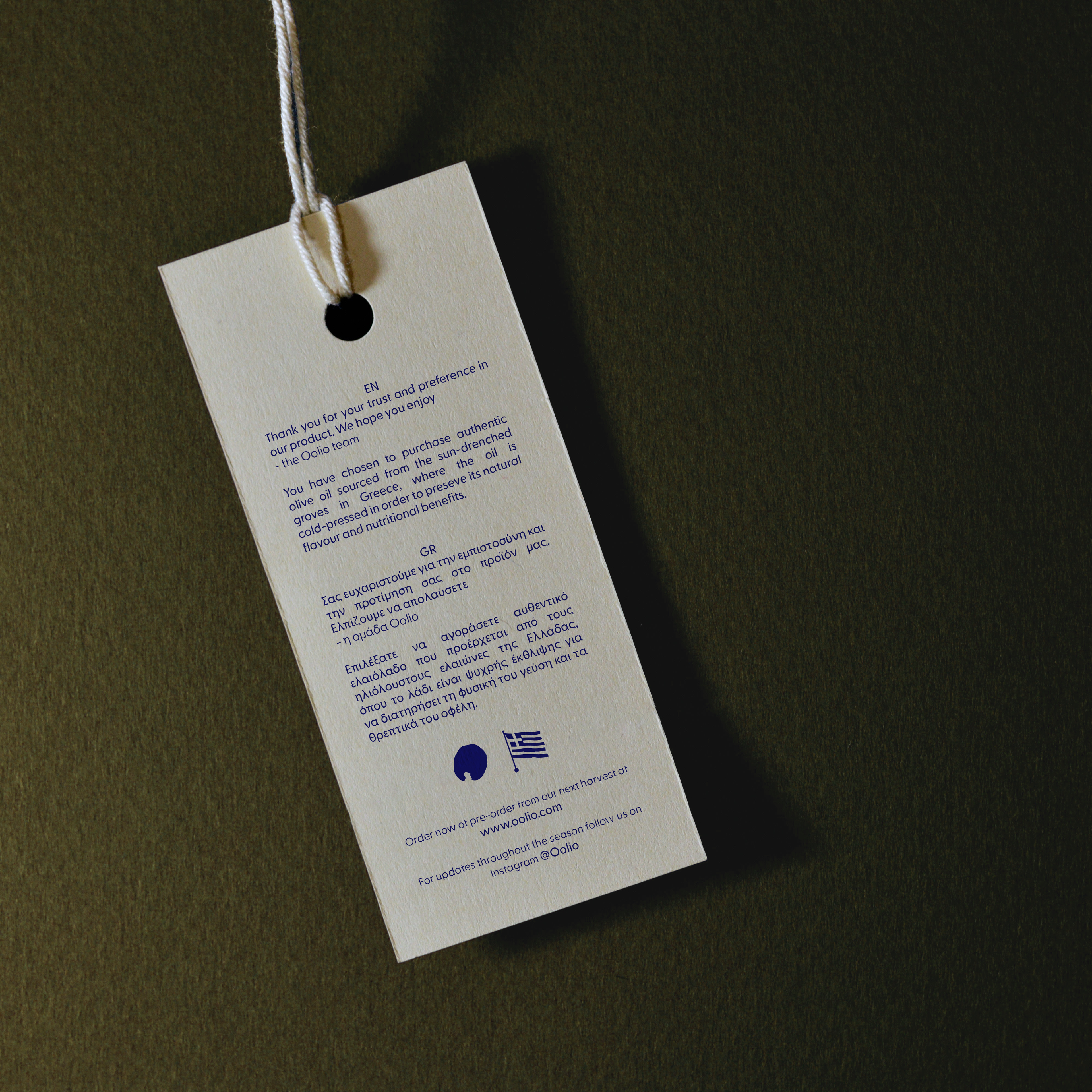
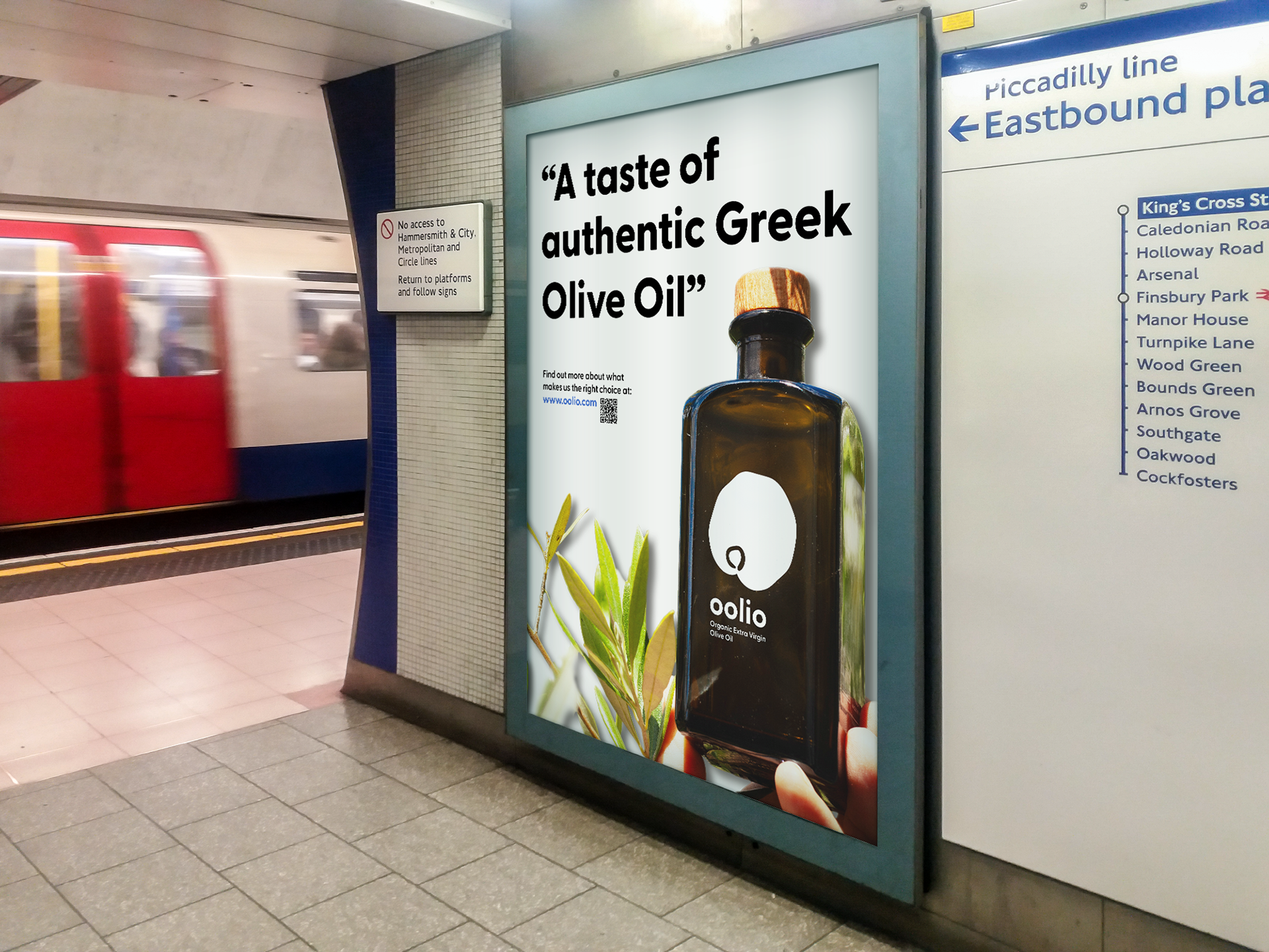
The aim of this project was to create the identity for a premium, authentic Greek olive oil brand called Oolio. The designed brand must have a bold approach in order to bring out a fun & lively spirit which should be inspired by Greek heritage, pulling from the traditional olive cultivation process. The desired deliverables for this project include a brand identity, packaging design & thank you cards (which are inside the package when bought). This project was completed as part of a weekly online design competition set by @designerbriefs x @thebriefassociation on Instagram.
Response
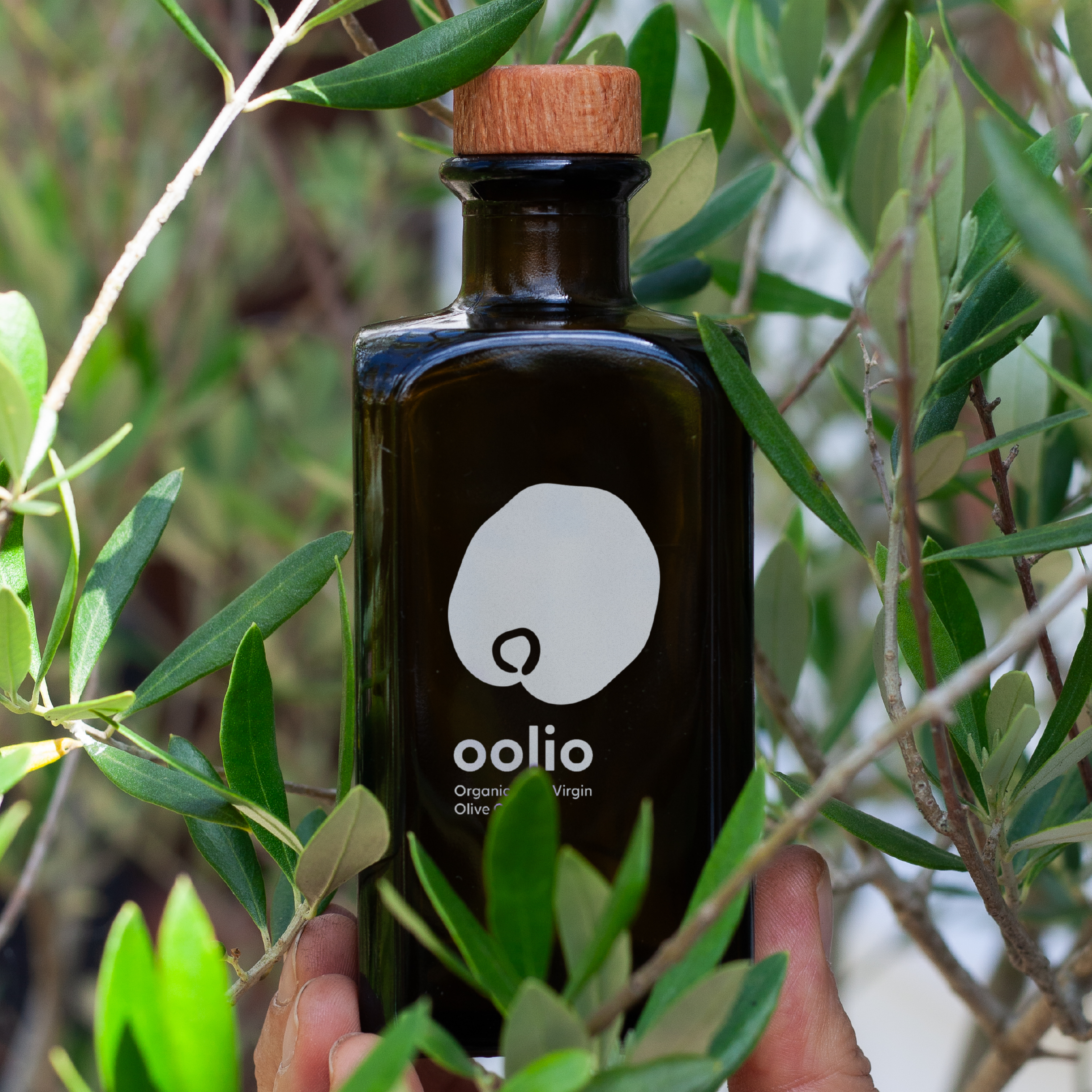
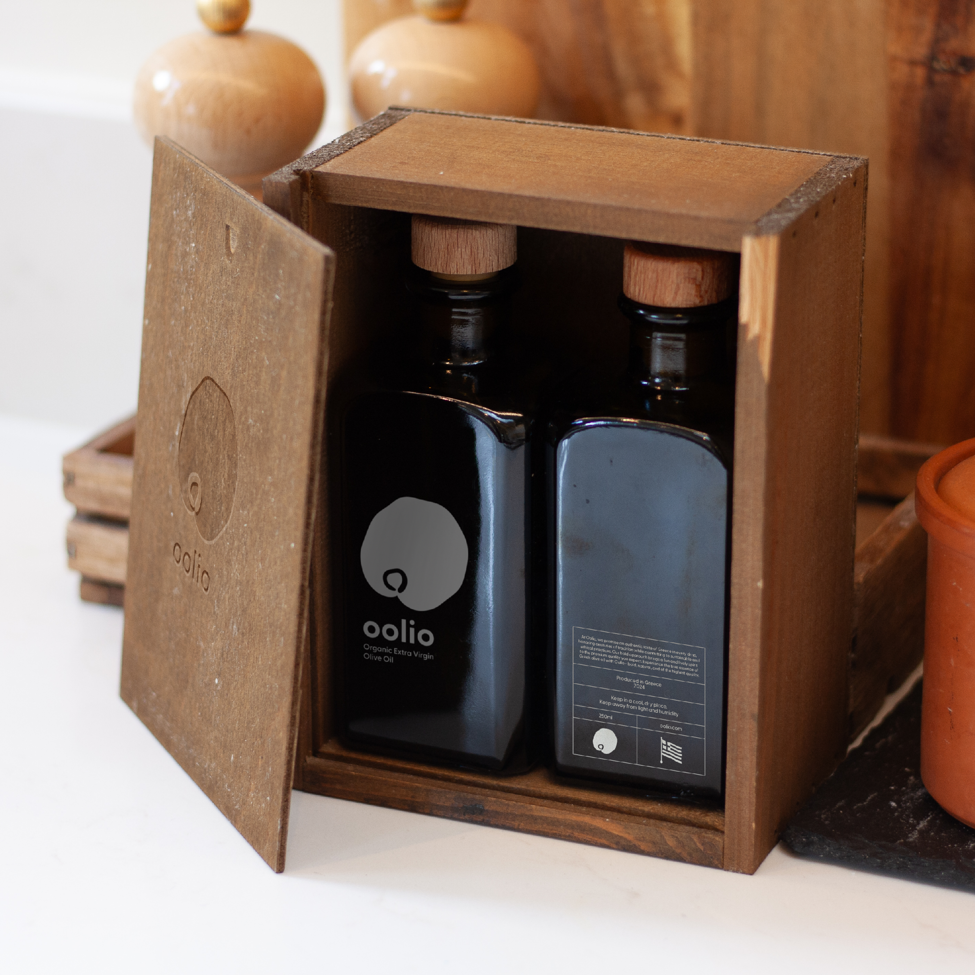
The design route I went down features a simple logomark and logotype, reflecting the smoothness of an olive while adding a touch of character in the irregular edges of the olive logo. I kept the brand monochromatic as it would primarily be seen on the olive oil containers themself, adding in the dark greeny-yellow colour that they are which contrasts the white. The bottle and packaging designs have a minimalistic style, leaving the product to speak a lot for itself, maintaining a feeling of premium quality & tradition which has been put into the contents.
While this was a relatively short brief (being just a few days long) I took it upon myself to conduct a photoshoot for my own mockups which portray the brand's tone in a more suitable, physical manner which cannot be found online in existing mockups. The photos were edited in post-production software (Adobe Lightroom & Photoshop) before being used.
Deliverables
• Branding
• Motion Graphics
• Product Design
• Packaging
• Static Adverts
• Animated Adverts
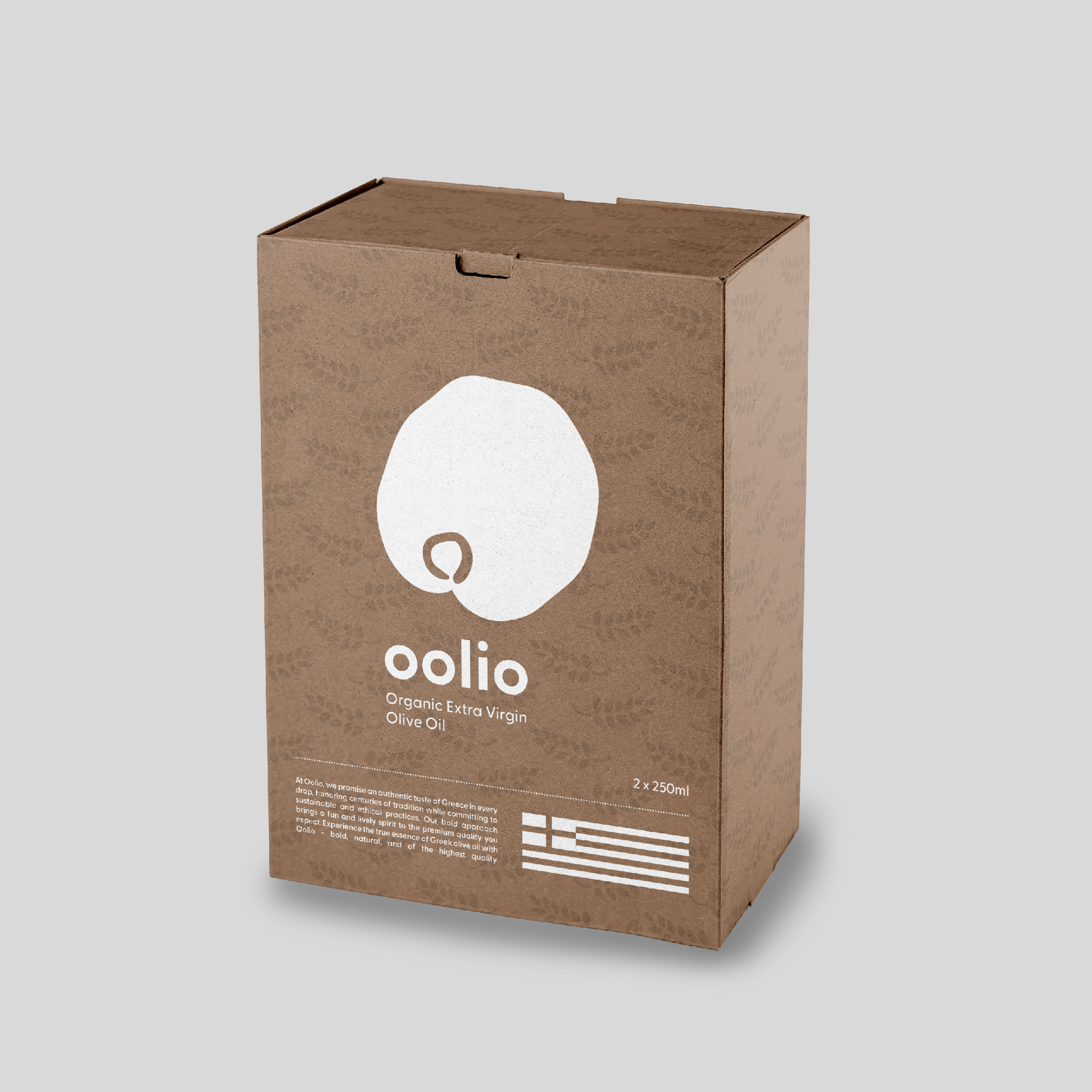
Product packaging (seen on shelf)