Tokyo House - Looks Delicious
Personal Project
Brief
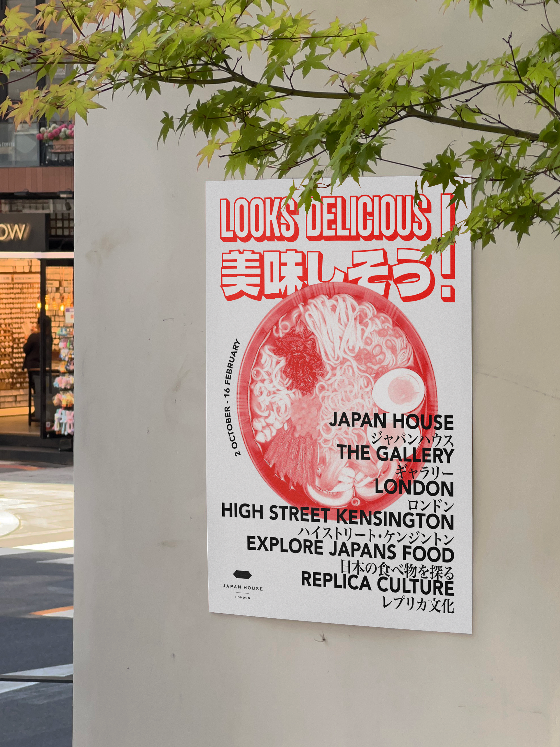
This was a self-set brief with the purpose of rebranding one of Japan House's exhibitions, 'Looks Delicious!'. This exhibition is all about Japan's history of food replica models, quite an unconventional piece of art but is prominent in Japanese culture as well as other countries in Eastern Asia. I decided to set myself this brief as I am interested in the exhibition and thought that it could do with its own unique branding in order to stand out and draw in attention from people in London.
I set myself the goal of designing a range of deliverables for this exhibition, including:
- 'Looks Delicious!' Exhibition branding
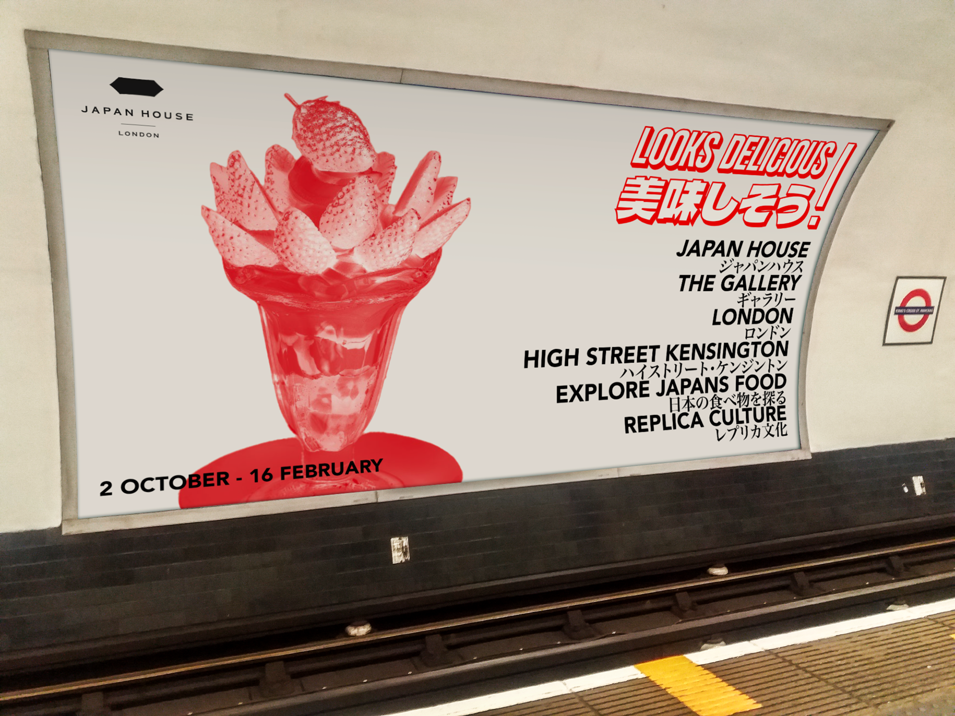
- Print advertisements
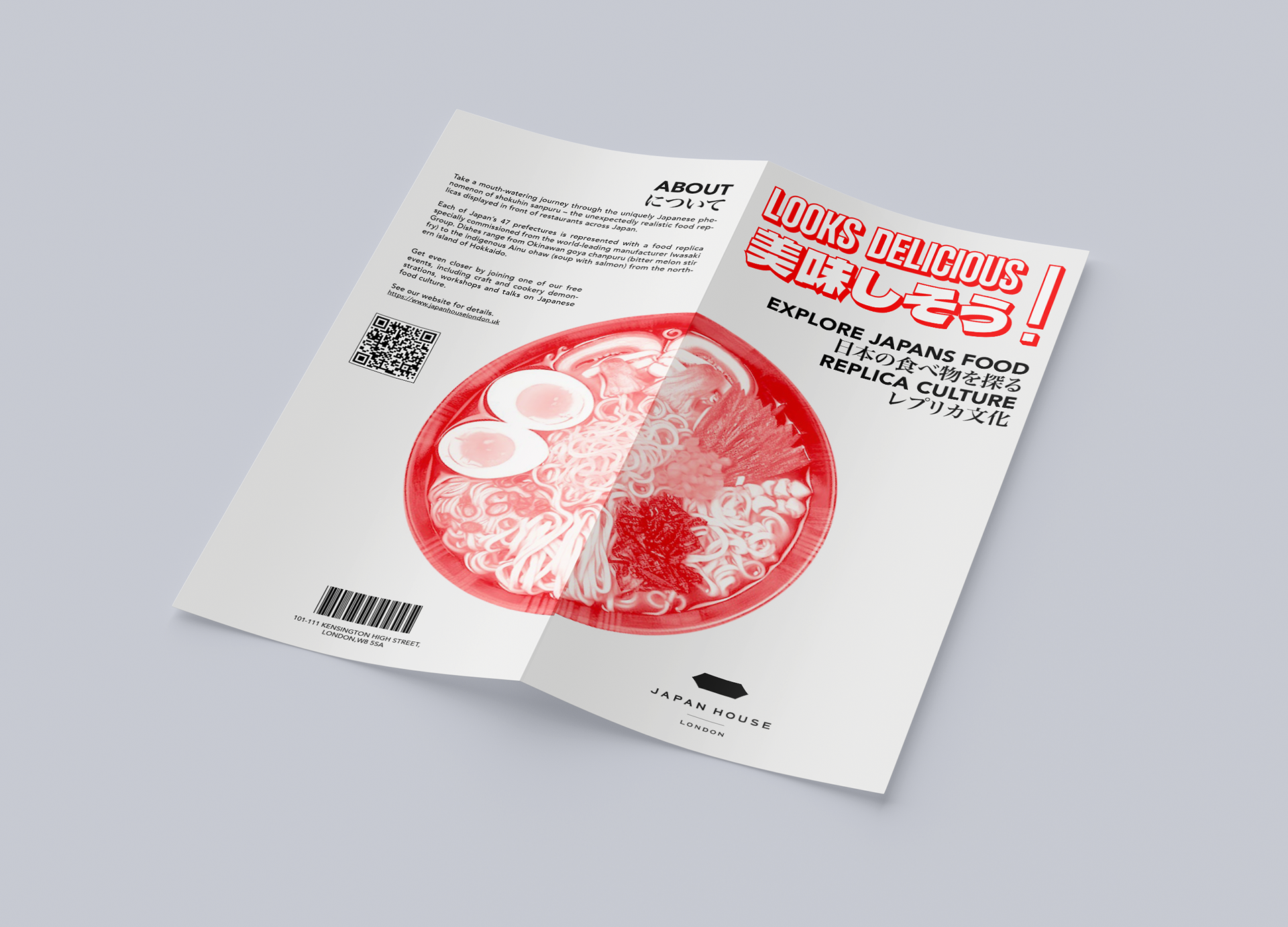
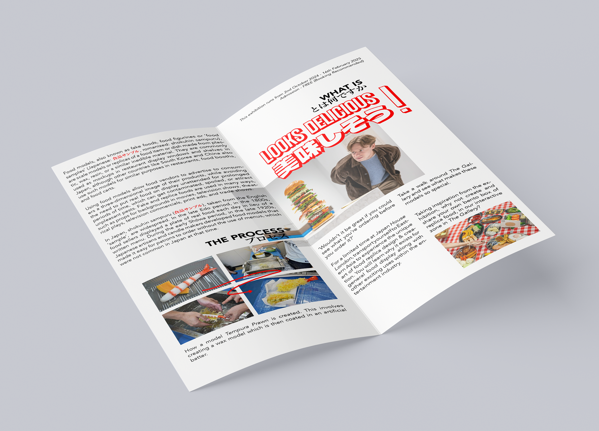
- Event info leaflet
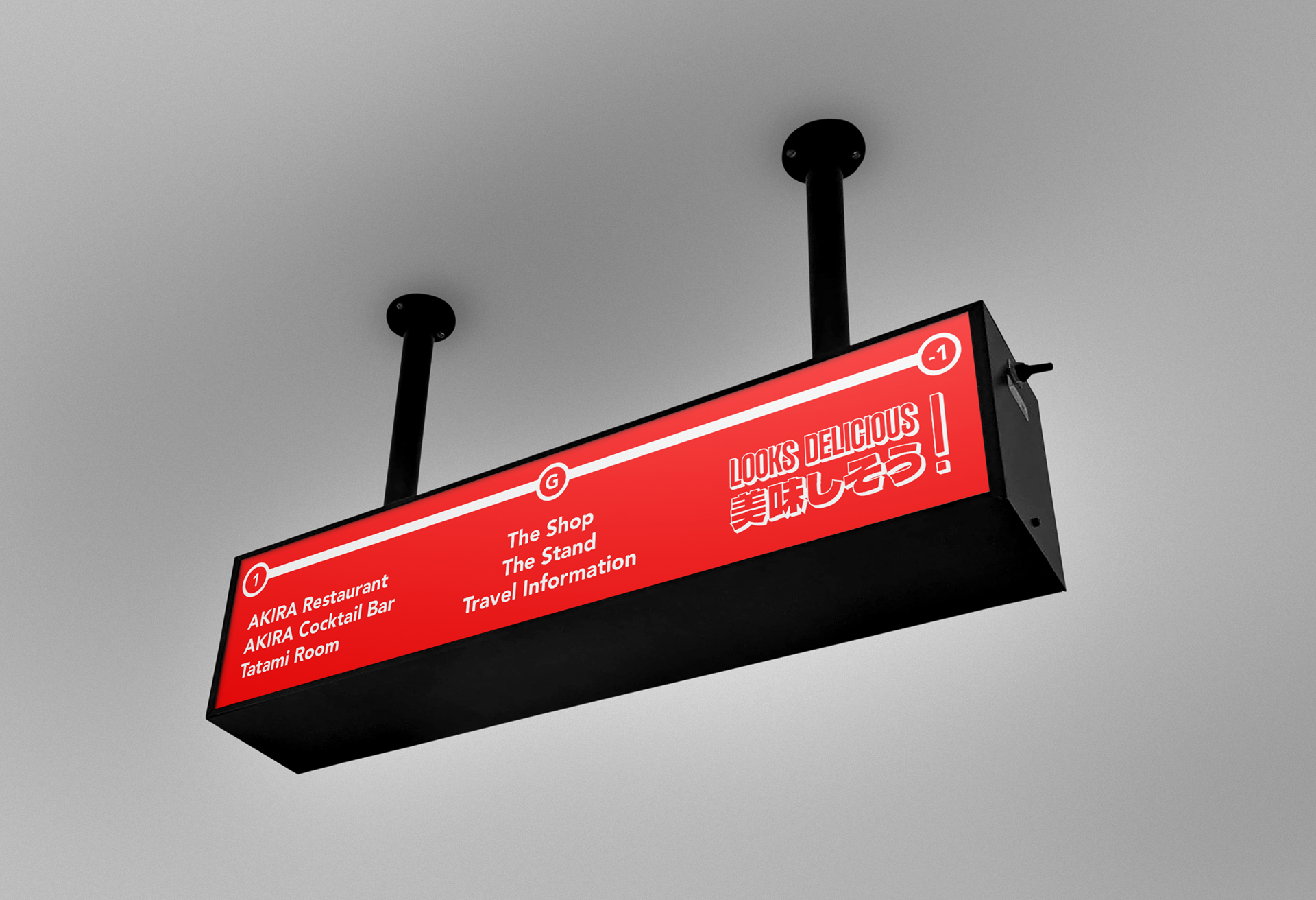
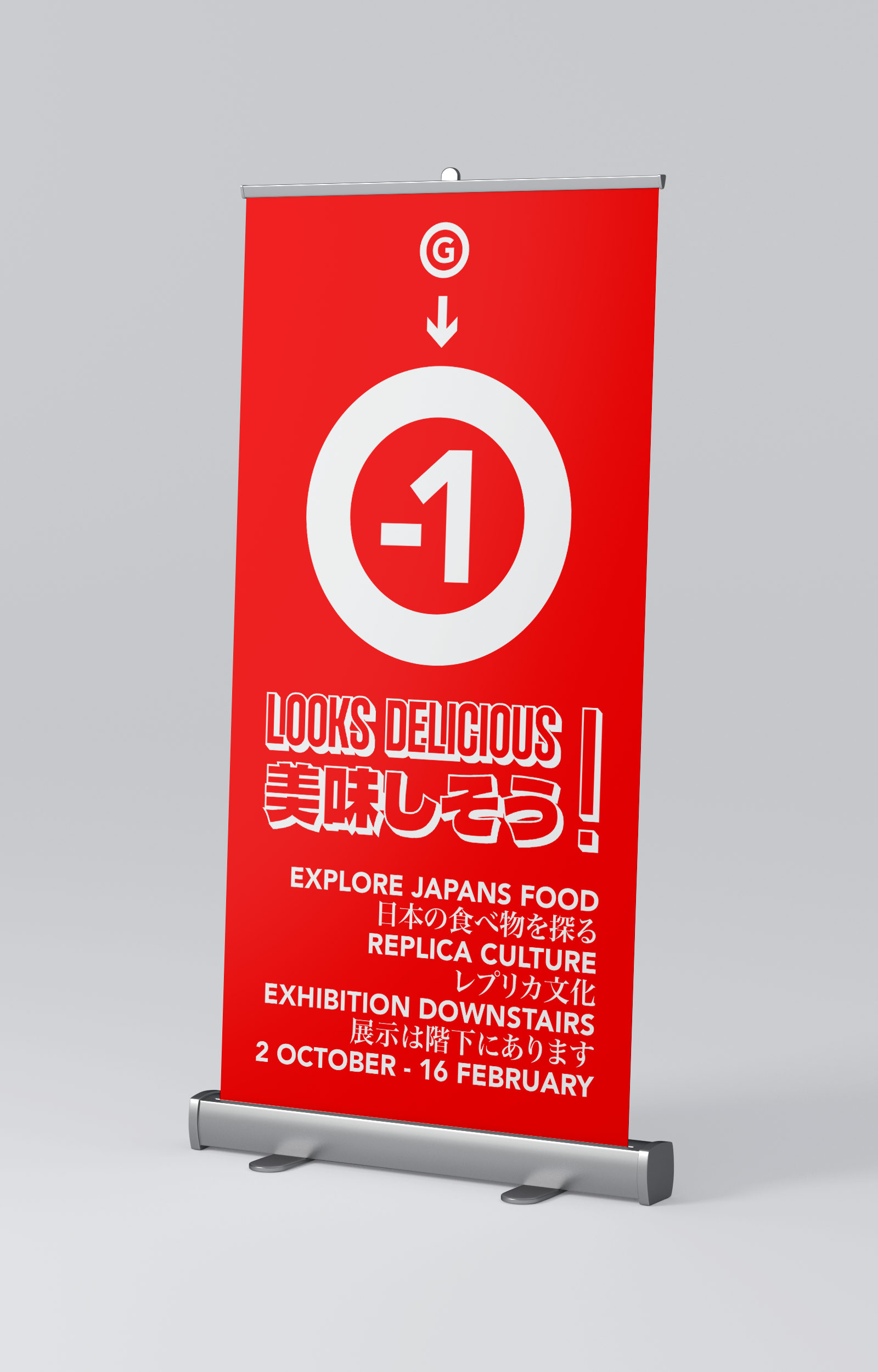
- Signage & wayfinding
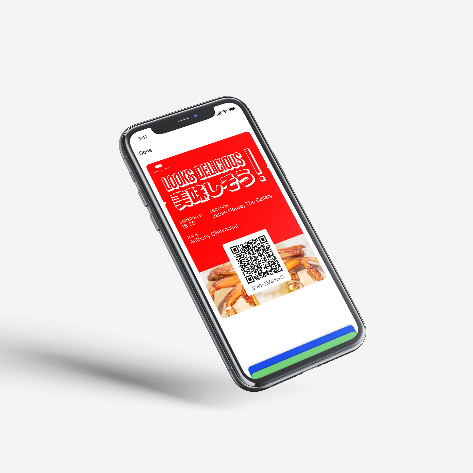
- Tickets (physical & digital)
Approach
My approach to this brief was inspired by a range of designers and their use of Japanese layout design. I used a style which capitalises on white space and minimal colour usage, allowing the viewer to focus on the text and imagery. The images I used are from the exhibition itself on the Japan House website (+ a few other free to use images).
The colour palette of my designs is extremely simple, using only light grey and RGB red (as used on Japan's flag) to symbolise the Japanese flag. On the posters and leaflet, the food images have been positioned close to the centre of the page with a red/white gradient map effect to represent the Japanese flag once again.
The typography is bold to catch the viewer's attention and the text has a clear hierarchy which displays the information in order or importance (exhibition name, location, description). I have introduced Japanese text to my designs not just to be read and understood but because of the artistic appearance of it which helps to break up the English text and reduce the blank spacing between it. Some of the deliverables I created have a visual hierarchy which leads the viewer from right to left, drawing inspiration from Japanese media which is read the opposite way to English.
The inside of the leaflet has a much more experimental layout than what I am used to, but I feel that it works well in terms of hierarchy and general information display/legibility. It can be read left to right or right to left depending on how the reader feels as the information is not chronological and you don't need to read one side to understand the next.
Any signage/wayfinding designs created for this project are heavily inspired by the Japanese metro system, something that I was interested in on my travels because of how simple yet informative it is.
Inspiration:
Vitor Manduch
Daigo Daikoku