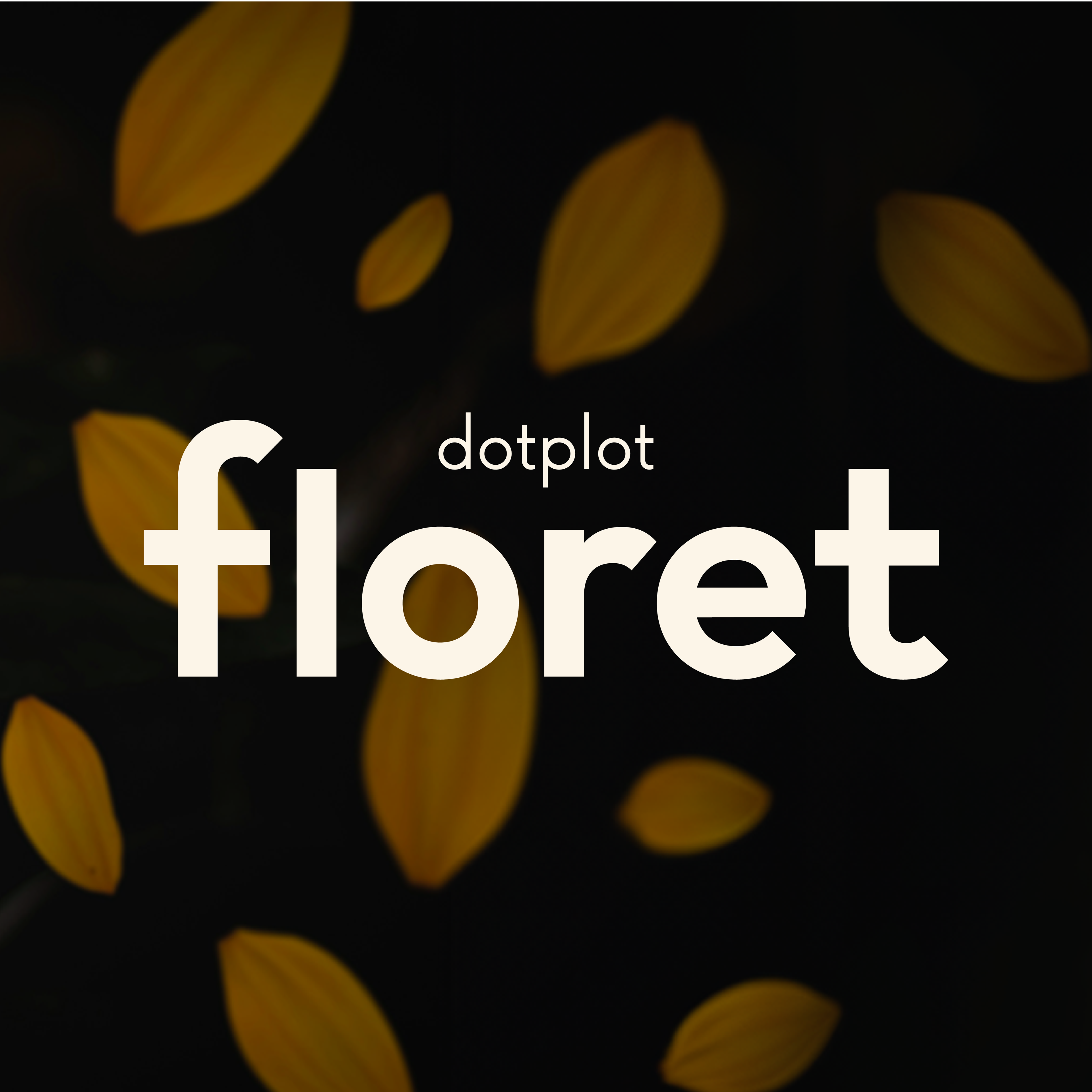
Floret by Dotplot
Design Competition
Brief
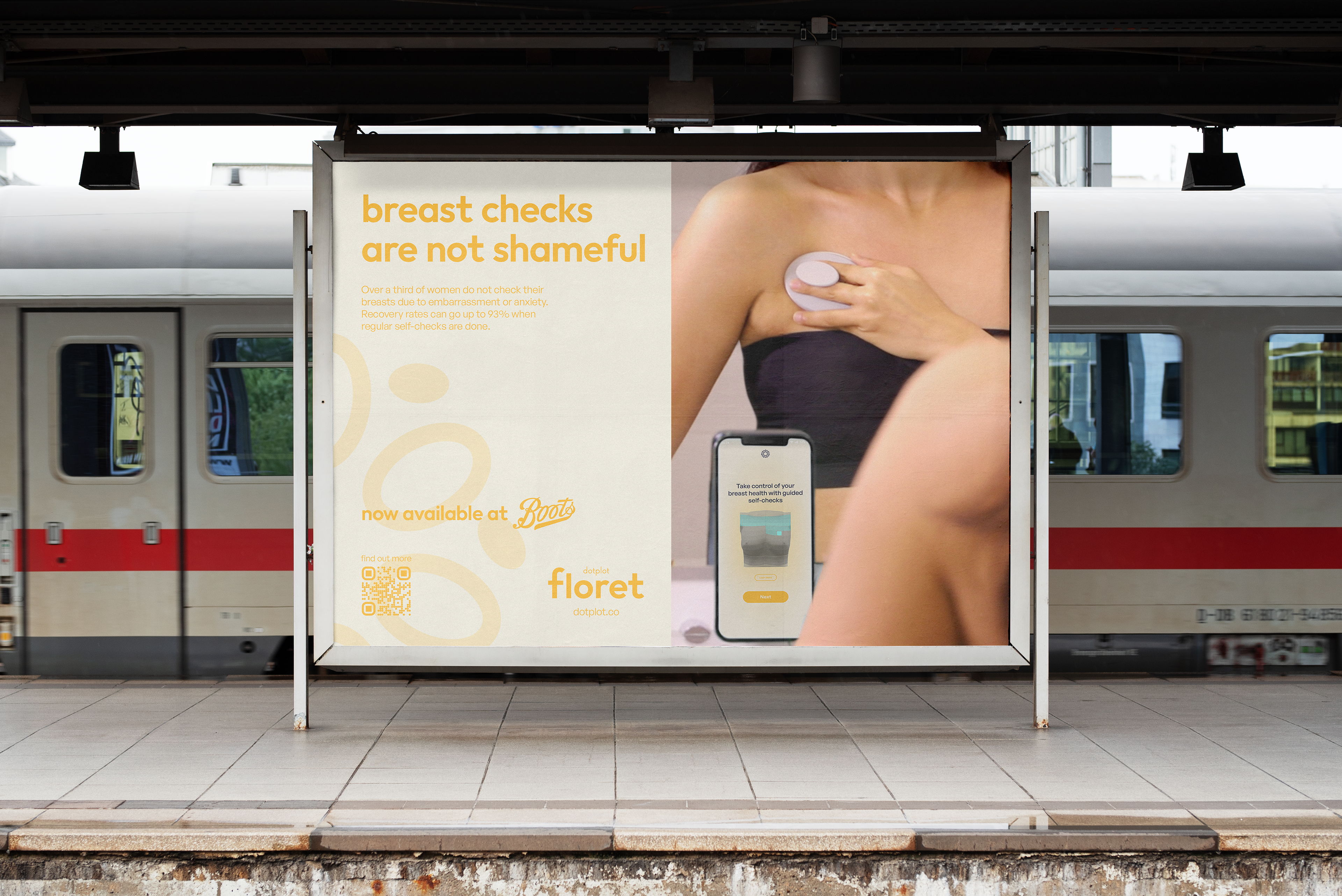
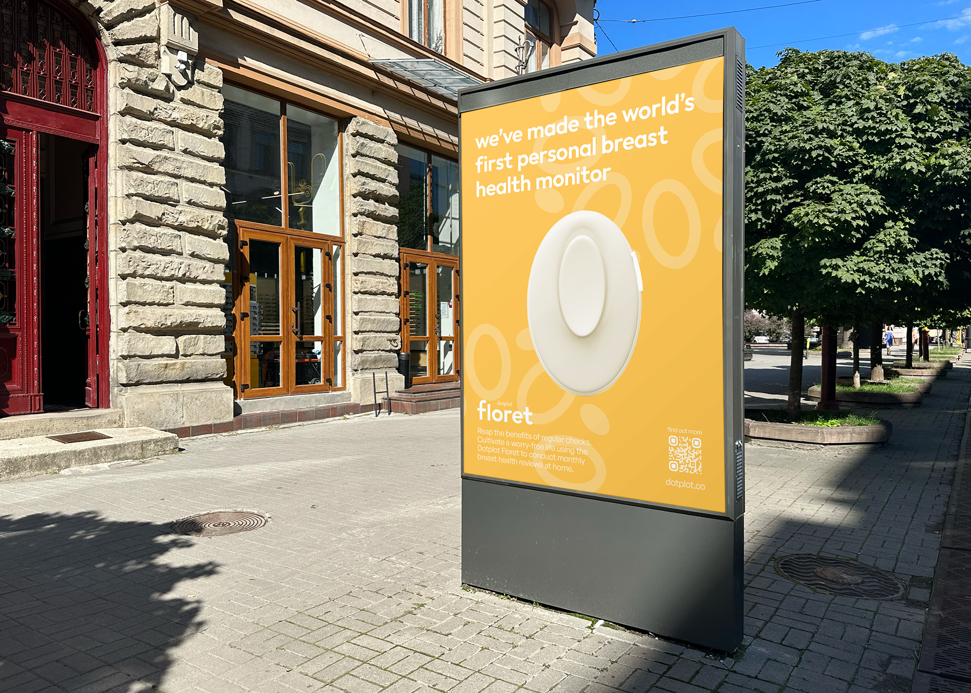
As part of the Dots challenge set by Dyson, me and a team of two others had to come up with a brand identity for 'the world's first breast health monitoring device'. We were given complete creative liberty to design an identity that we thought was fitting for the product and would assist its launch.
About the Product
It’s a handheld device paired with a mobile app that addresses the confusion surrounding self-checks. The app provides timely notifications on when to scan, with real-time guidance on how to do it and accurate readings compiled into a report that can be shared with healthcare professionals.
Deliverables
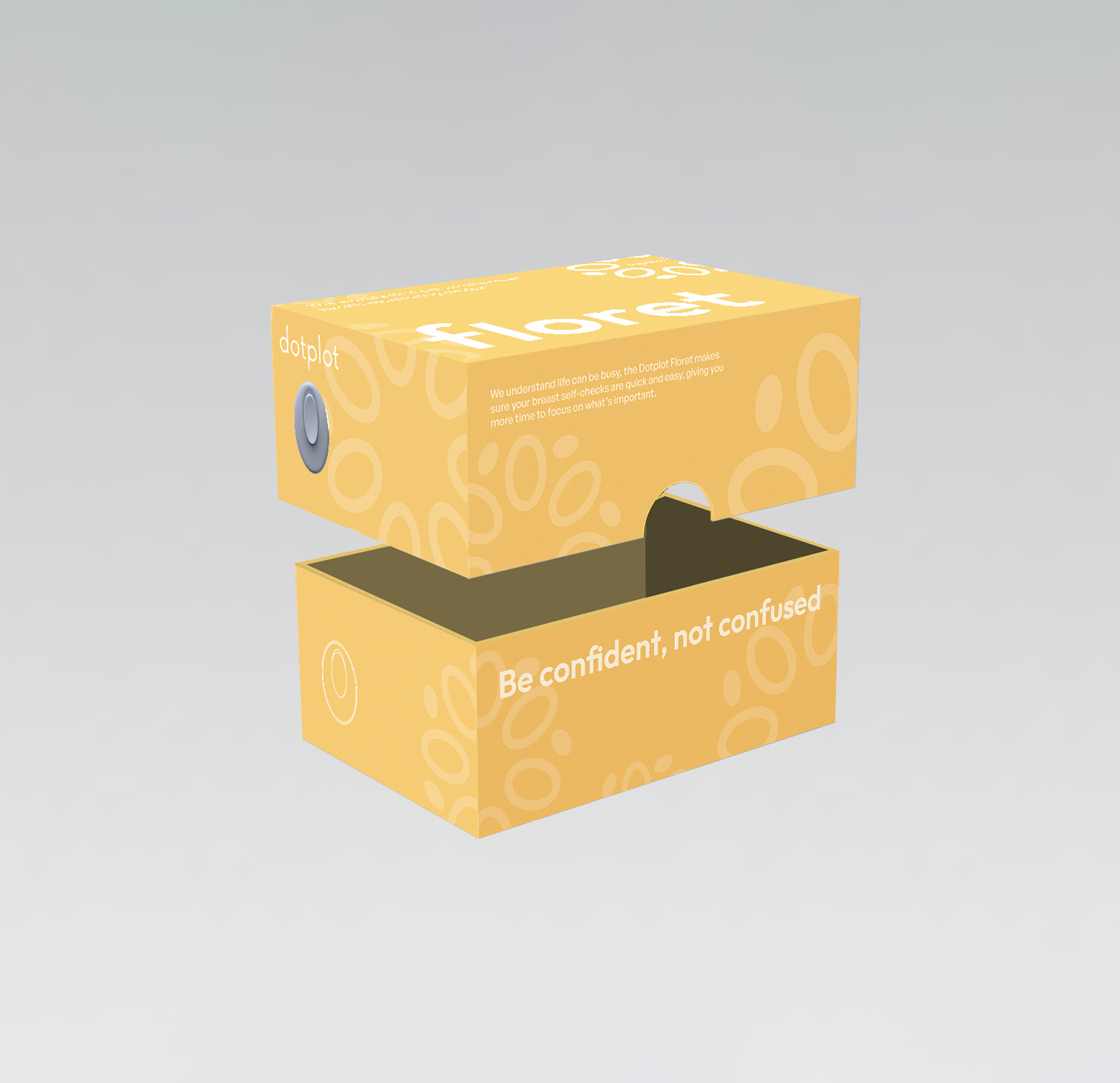
• Product Branding
• Static Advert Designs
• Product Packaging
• Social Media Posts
• Cohesive Brand Guidelines
• Copy Matrix
Team members:

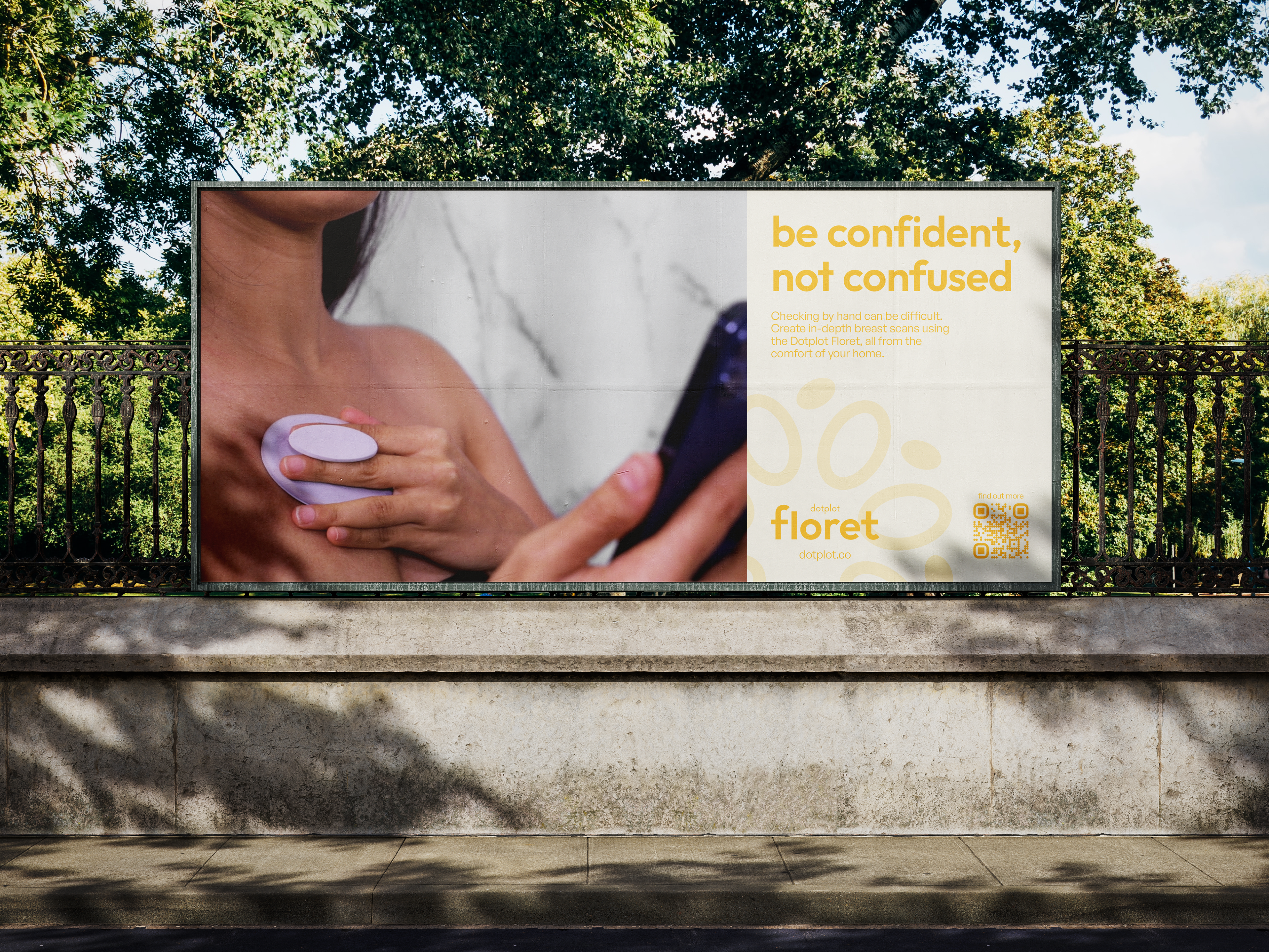
Outdoors Advertisement
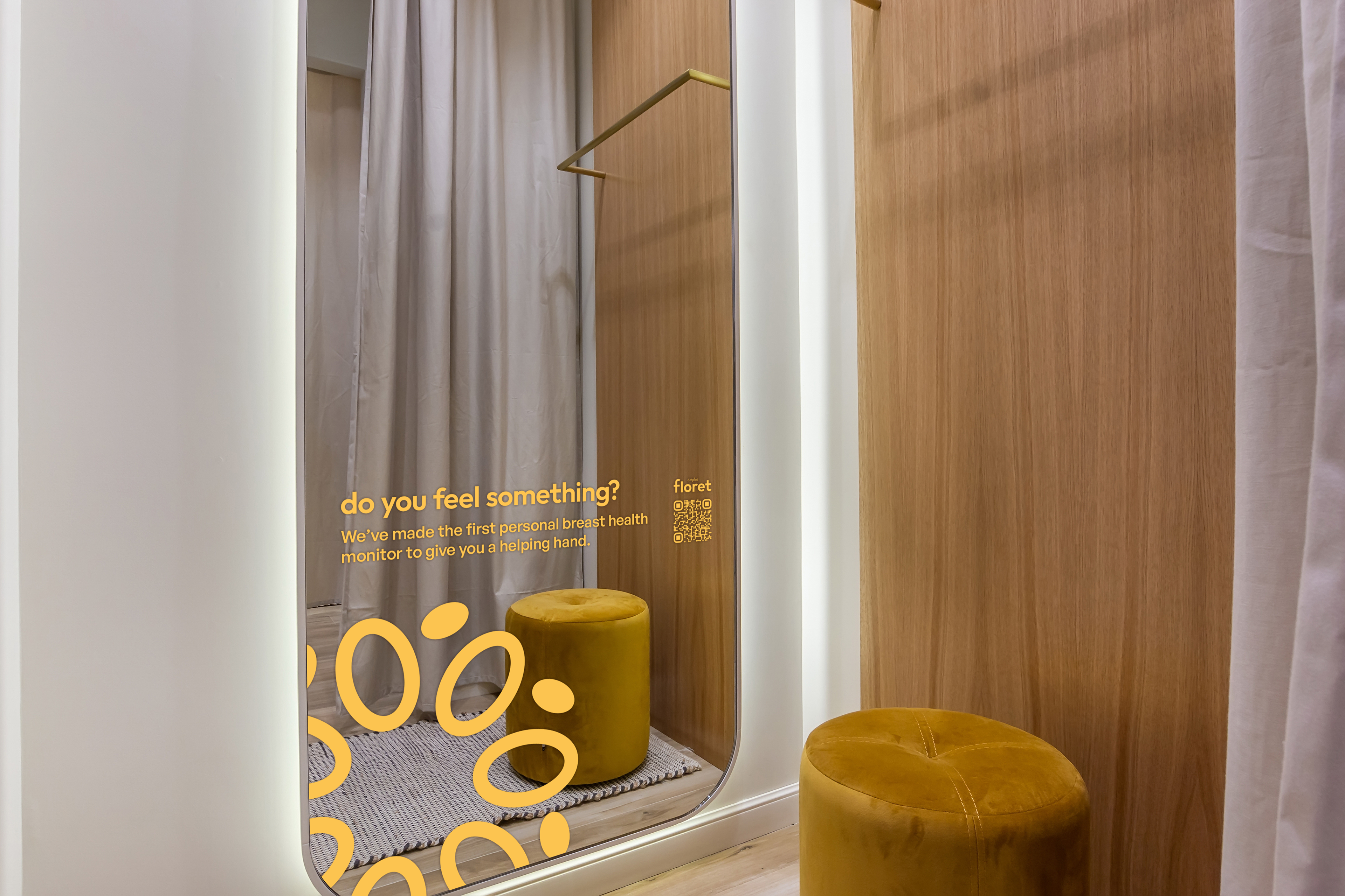
Changing Room Mirror Advertisement

Gym Mirror Advertisement
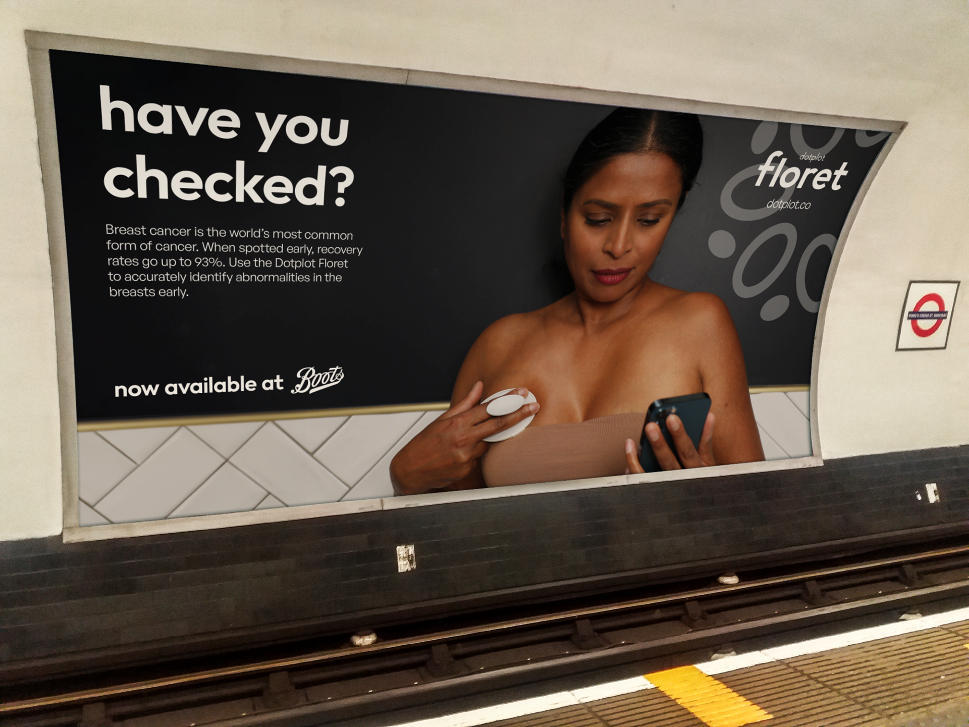
Underground Advertisement
Train Station Advertisement
Digital Product Launch Poster
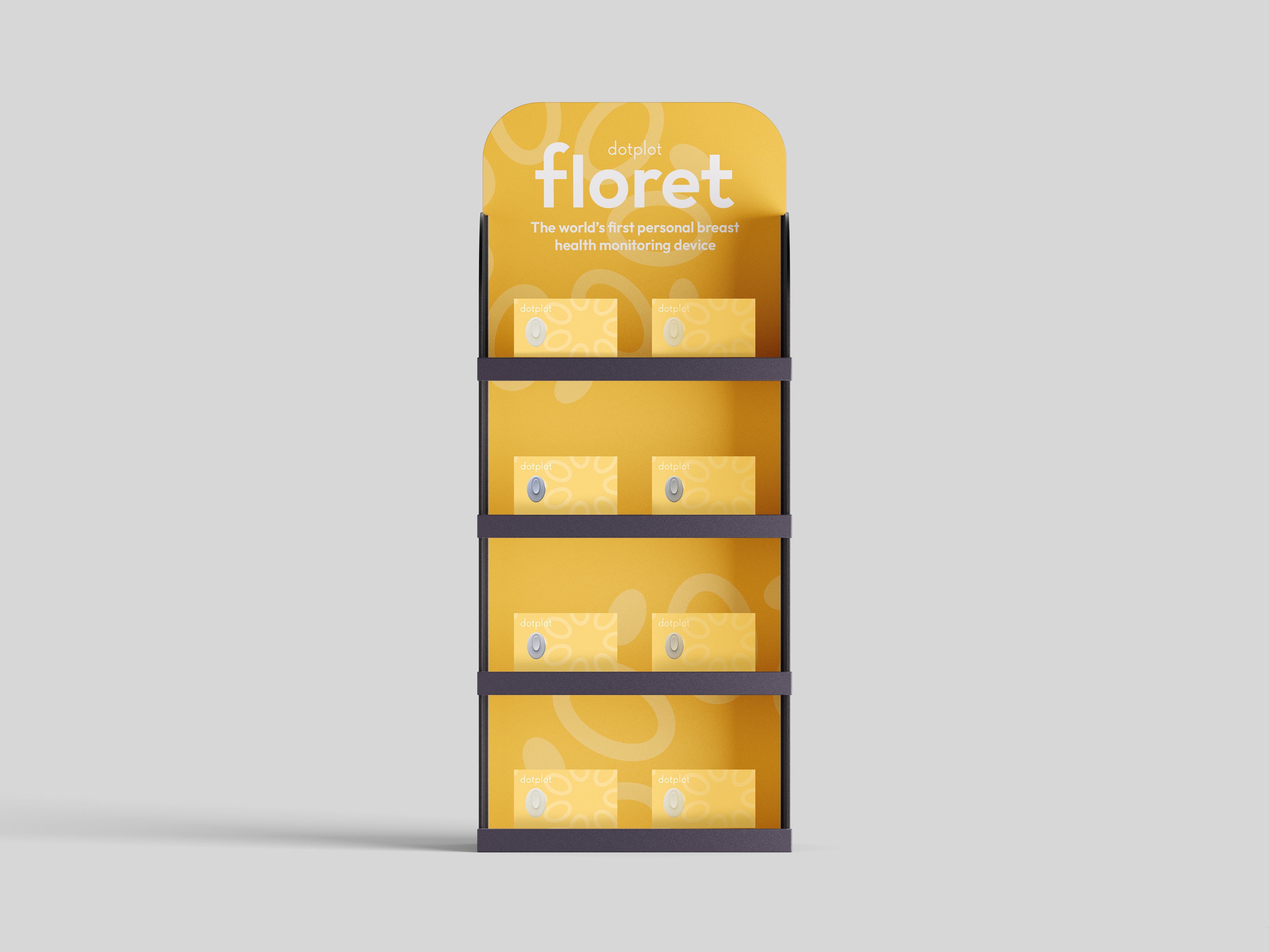
Product Display Shelf
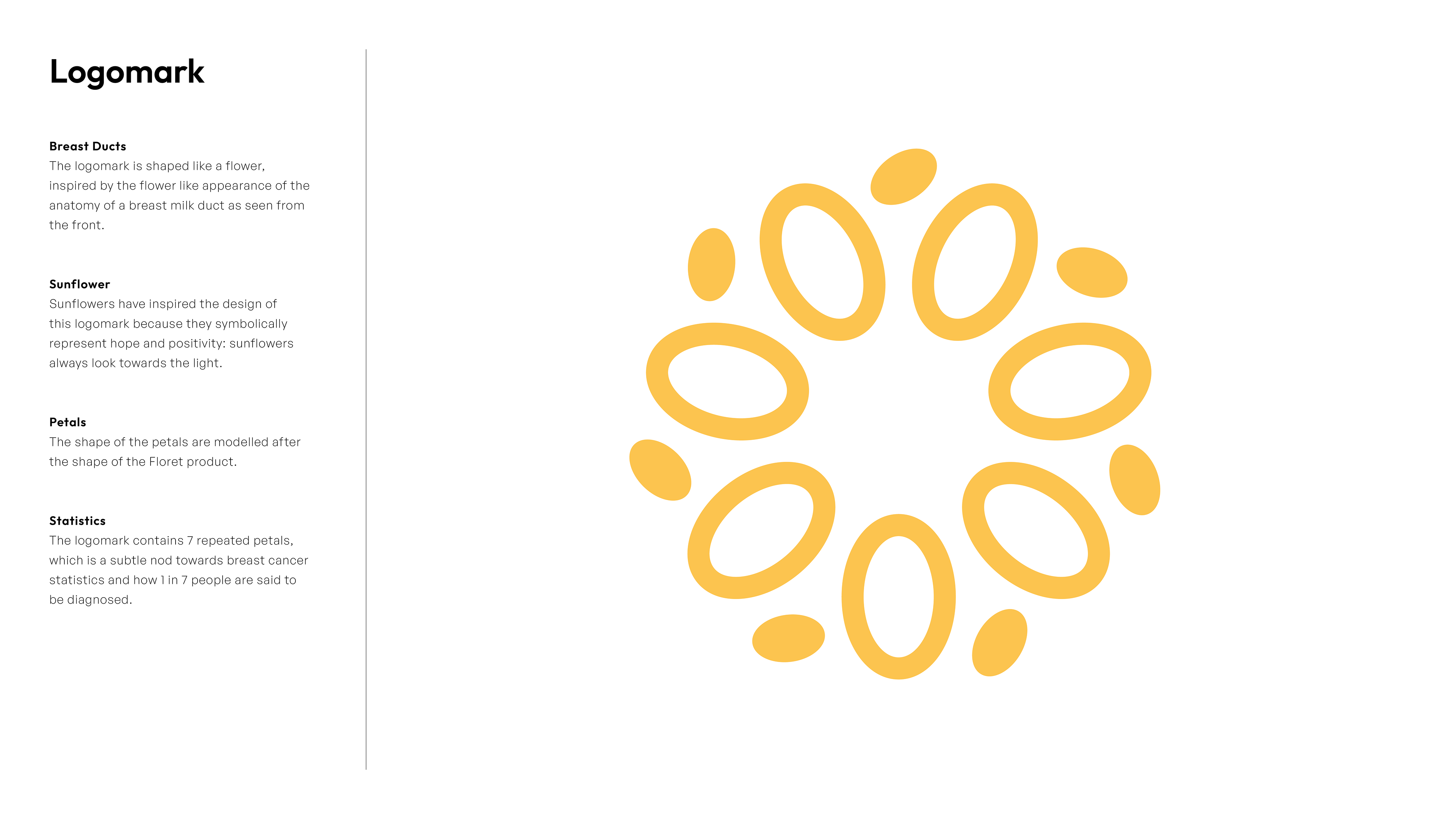
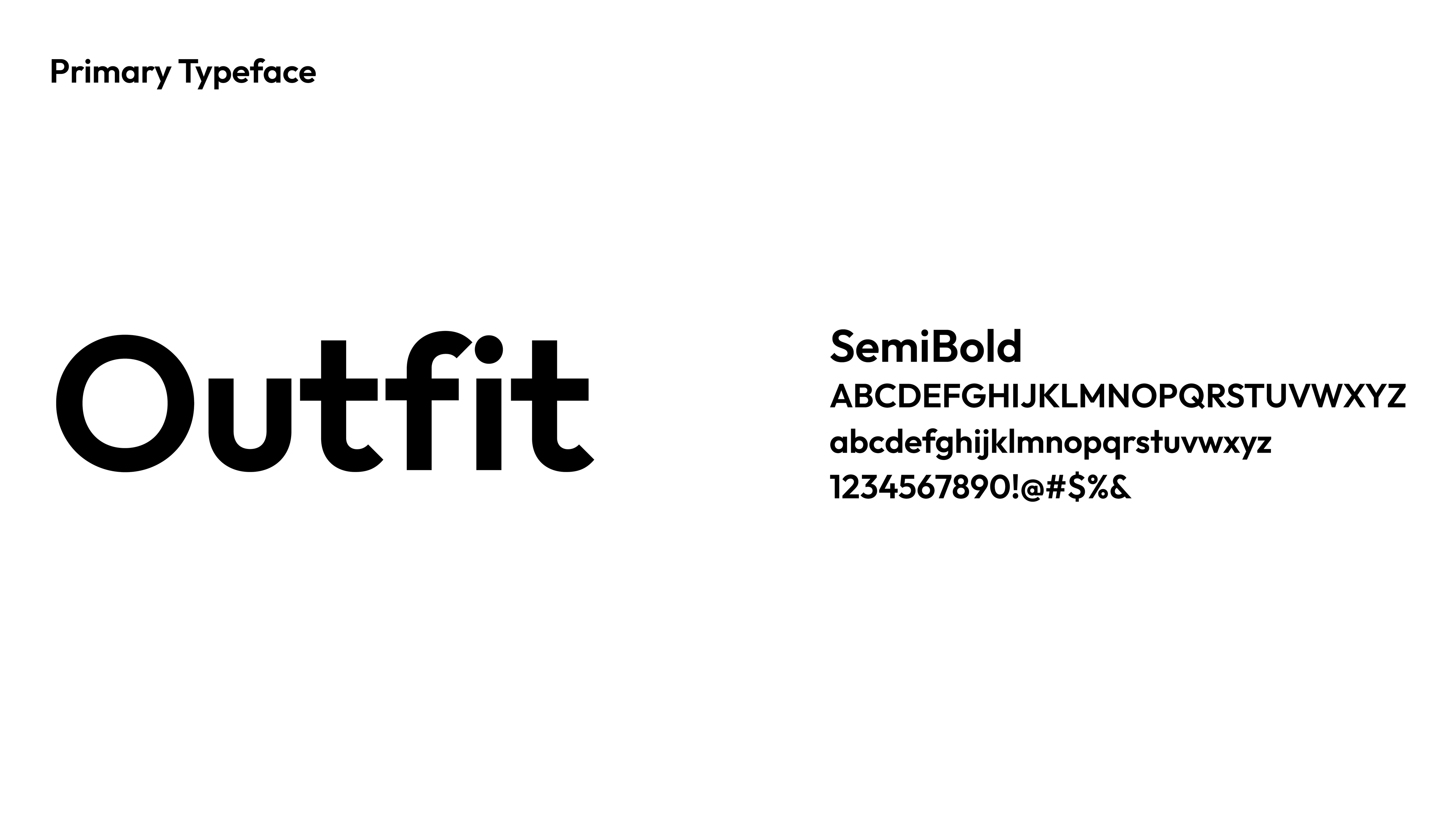
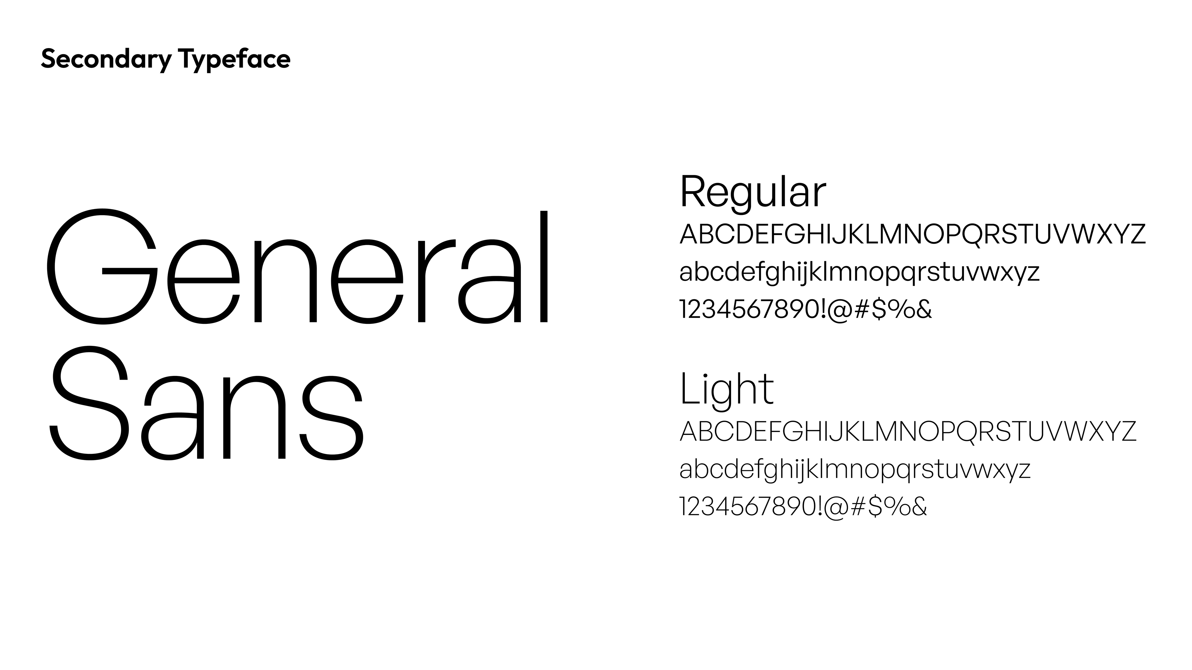
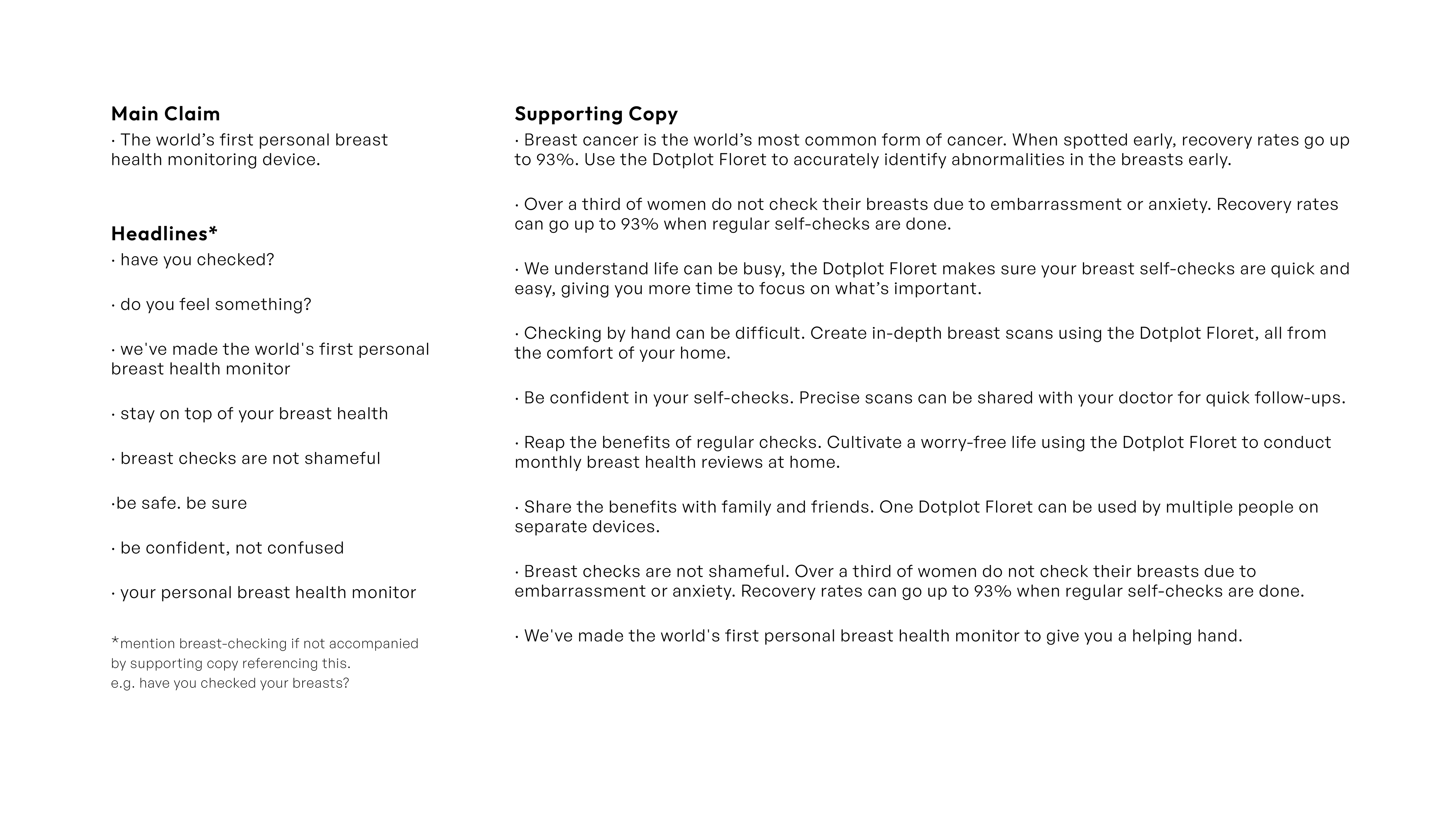
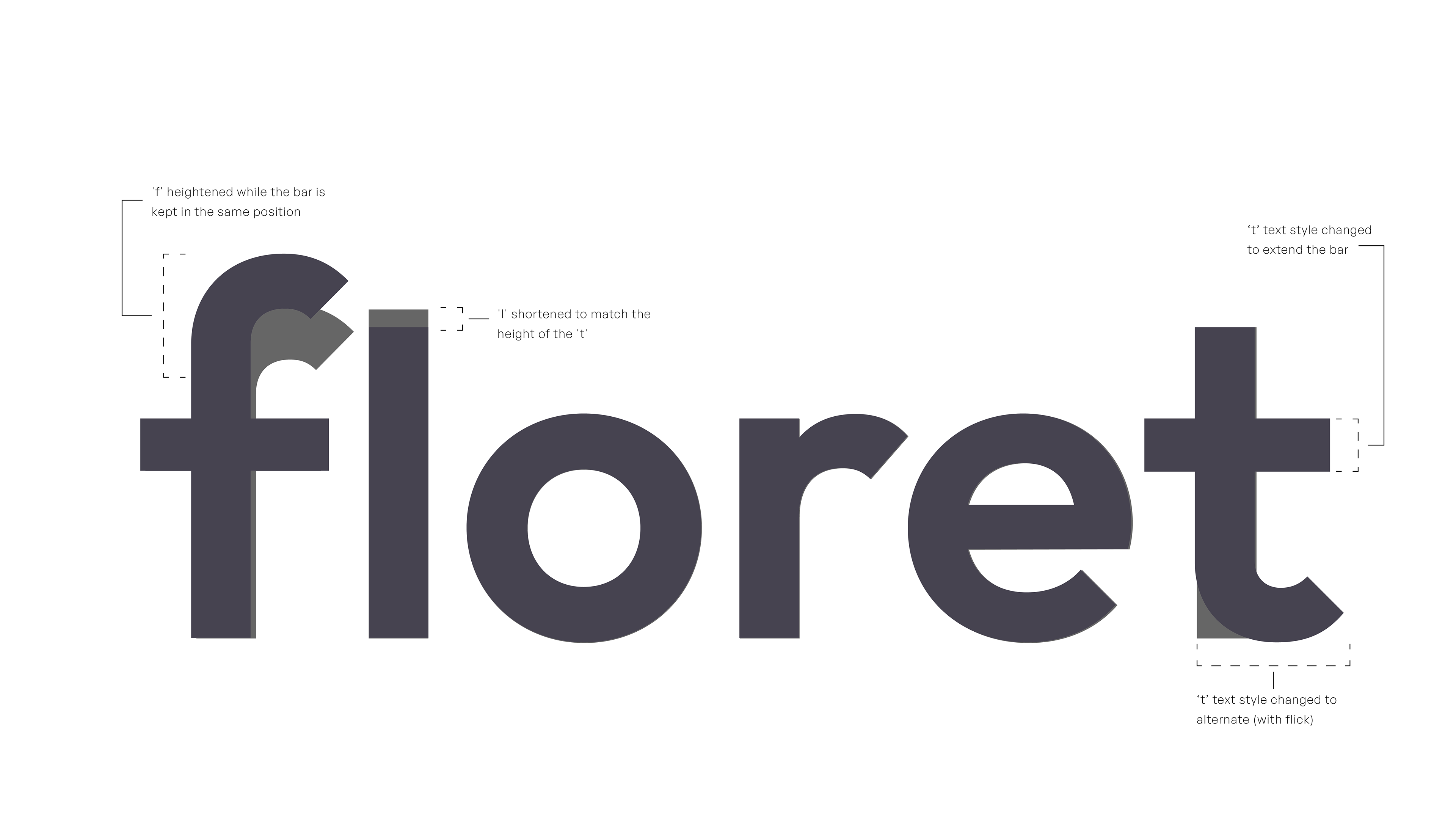
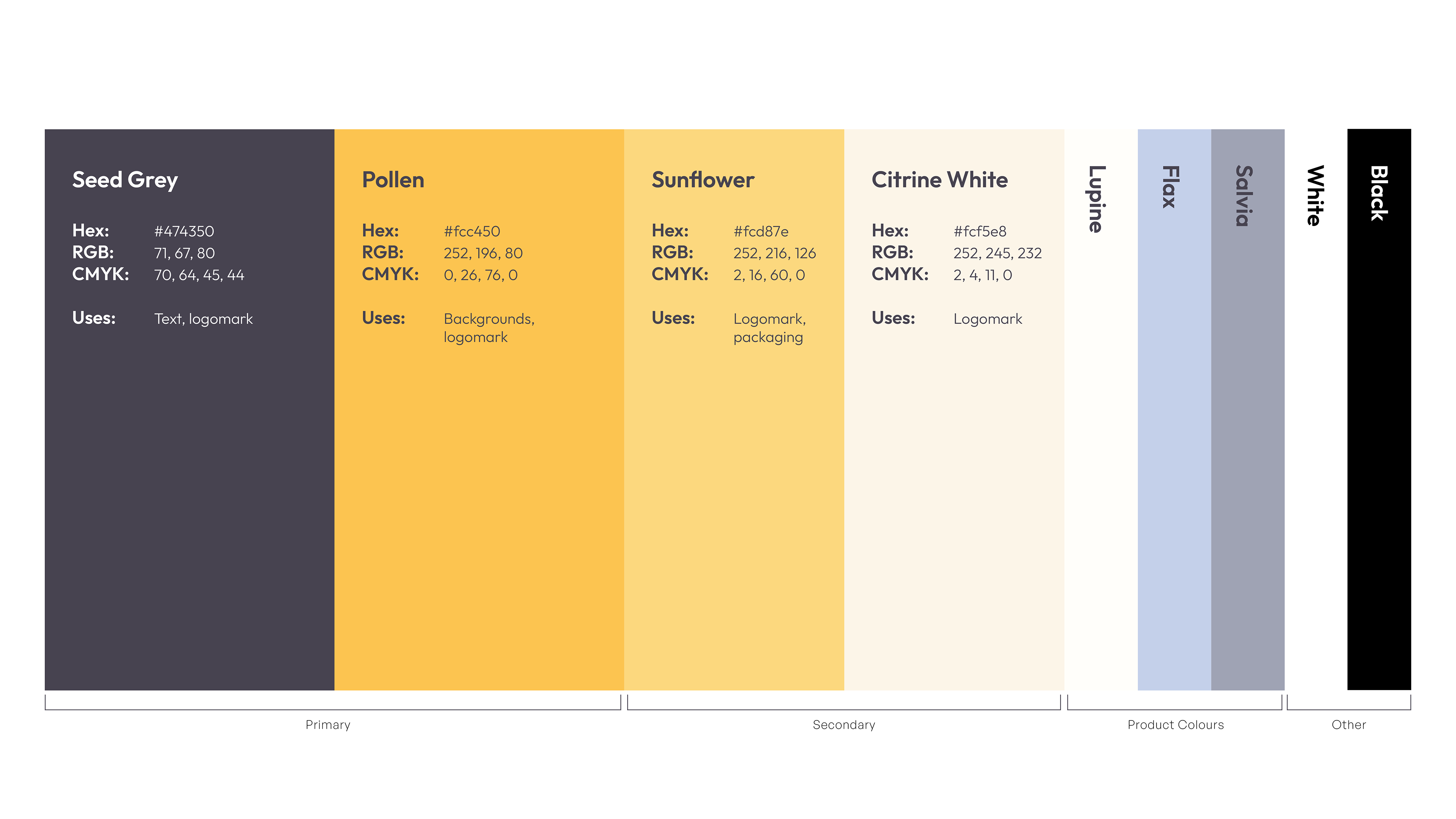
As any brand identity should have, I created brand guidelines which were used throughout the entire design process. Those guidelines were included in the final project presentation (displayed below).